[vc_row css_animation=»» row_type=»row» use_row_as_full_screen_section=»no» type=»full_width» angled_section=»no» text_align=»left» background_image_as_pattern=»without_pattern»][vc_column][qode_elements_holder number_of_columns=»two_columns»][qode_elements_holder_item advanced_animations=»no» item_padding=»280px 40px 0px 20%»][vc_separator type=»normal» up=»70″ down=»0″][vc_column_text]
Websites
[/vc_column_text][vc_separator type=»small» position=»left» color=»#121212″ thickness=»5″ width=»56″ transparency=»1″ up=»23″ down=»61″][vc_column_text]
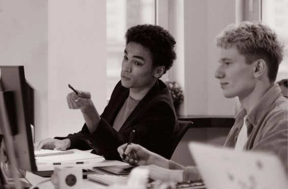
Perhaps the most important decision in setting an appropriate tone is choosing a typeface or font. A typeface is a family of fonts, each font being a different style (for example, Arial is a typeface, Arial Bold, Arial Narrow and Arial Regular are all fonts of the Arial typeface). There are a number of categories of font including Roman (serif, sans-serif, script and ornamental), Blackletter, Monospaced, Symbol and others in between. Each of these will give a fairly distinct feel to a piece, however as always, it depends on how you use it. Kerning is adjusting the space between individual letters and is often used in detail-oriented projects such as logo design to make the spaces between letters look even.
Using color in design is a class in and of itself, but we can touch upon some general techniques here.
[/vc_column_text][vc_separator type=»transparent» up=»23″ down=»22″][/qode_elements_holder_item][qode_elements_holder_item advanced_animations=»no»][vc_single_image image=»15531″ img_size=»full» qode_css_animation=»»][/qode_elements_holder_item][/qode_elements_holder][/vc_column][/vc_row][vc_row css_animation=»» row_type=»row» use_row_as_full_screen_section=»no» type=»full_width» angled_section=»no» text_align=»left» background_image_as_pattern=»without_pattern» padding_top=»93″ padding_bottom=»93″ background_color=»#f4f4f1″][vc_column][vc_column_text]
One of the most influential of all twentieth-centuiry art movements
[/vc_column_text][/vc_column][/vc_row]